Sensitivity Analysis
Rate of Return Before Tax
IRR (%)
Inflation Rate (Percent) In any planEASe projection, there are several assumptions whose values are inherently uncertain. For instance, you enter the inflation rate that will prevail during the time you own the real estate. Additionally, you enter the number of years you will hold the property before selling and the capitalization rate (or other method) determining the sale price. These values are uncertain. As you perform the analysis, the worth of the investment is measured by the system in terms of rates of return and net present values. Additionally, you may choose the Capital Accumulation and the Capitalization Rate, Cash on Cash Before Tax, or Debt Coverage Ratio shown in the Ratio Analysis section of the ProForma Income Statement and Annual Statements for the Sensitivity Measure. The concept of Sensitivity Analysis is to investigate how these measures vary with a change in one of the assumptions. Any measure and any assumption may be chosen for the Sensitivity Analysis.
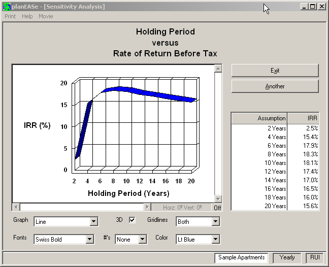
Sensitivity Analysis provides a one page table and graph which describes the relationship between the assumption value and the resulting measure, as shown in this “Example Sensitivity Analysis” screen. Here the user has asked how the Rate of Return Before Tax changes as the Holding Period is varied. The analysis shows the Rate of Return which would result if the property were held for two through twenty years. The graph of these results shows that the rate of return increases in a curved line, with the highest rate of return at eight years. Before that time, the appreciation on the property does not sufficiently overcome the costs of acquisition and selling. After that time, the buildup in the equity position overcomes the continuing appreciation, leading to the conclusion that this particular property should be sold or refinanced at that time.
Here is the graph from another Sensitivity Analysis. This time the user has asked how the Inflation Rate affects the Rate of Return Before Tax. The assumptions provide that the rents, expenses and property value change in line with inflation, so it is intuitive that the rate of return increases as inflation increases. This is what is meant by the commonplace that leveraged real estate is an excellent inflation hedge. It is one thing to simply state that an investment is a good hedge against inflation, but the Sensitivity Analysis capability in planEASe enables you to quantitatively evaluate that hedge and show graphically how the individual investment bene- fits from inflation. Here the rate of rate of return increases approximately 3.5% to 4% for each 1% change in the inflation rate, which is typical of highly levered real estate investments (80% Loan to Value in this case). The graph is flat before 3%
Rate of Return After Tax
IRR (%)
Price of Property ($K) inflation because the rate of return is negative in this area and planEASe reports a zero rate of return value in such cases.
These are but two examples of how you might want to use Sensitivity Analysis. For instance, how about a graph showing the after tax rate of return versus the vacancy factor or the sale price? Graphs like this provide one page visual answers to common questions about financial projections. Going further, suppose you’re syndicating a property. How about a graph of your fee on sale versus the Limited Partners’ Rate of Return After Tax? Could that help you plan your fee structure better? We think so.
The basic premise of Sensitivity Analysis is that the chosen assumption is “independent” of the other assumptions. That is, in performing the analysis, only the chosen assumption is varied, while the others remain as they were in the Basic Analysis. This can lead to some problems. For instance, the average inflation rate expected over ten years may well differ from that expected for the first year, and both those rates may be different from the rates assumed in both the Basic Analysis and the Sensitivity Analysis. For this reason, you should use care in choosing the assumption for a Sensitivity Analysis and interpreting the results.
The foregoing examples represent just the tip of the iceberg as to what you can do with this extraordinary Sensitivity Analysis capability. This graph shows the Rate of Return versus the Price of Property for the Sample Apartments. If the investor wants an After Tax Rate of Return of 15%, a graph like this tells him immediately that he’ll have to negotiate a price in the area of $980,000 for the Sample Apartments, all else being equal. You can use this capability to “back into” the property price which justifies a desired return, and then, if you want, substitute that price into the Assumption Set to print your reports with the desired return.
You must, of course, consider any dependencies in the Assumption Set when running Sensitivity Analysis. There are two loans assumed for the Sample Apartments: a $600,000 first and a $200,000 second. This graph assumes that these will be the loan amounts regardless of the price paid for the property, which may or may not be realistic. Alternatively, you could specify either or both of these loans to be a percentage of the purchase price in the Assumption Set, in which case the loan amounts in the calculations would change as the price is varied.
There are some assumptions that are inappropriate for Sensitivity Analysis, and planEASe will not allow you to use them in a Sensitivity Analysis. An example is the Sale Price Method. If you were to specify this assumption, and run for values from 1 to 10 in steps of one, you would end up with some very strange results indeed, because the Sale Price Parameter is “dependent” on the Sale Price Method. Thus if you have a value of 5 in the Sale Price Parameter, the Sensitivity Analysis for a Sale Price Method of one would treat the 5 as a Gross Income Multiplier, the value of two would treat the 5 as a Capitalization Rate, and so on.
Sensitivity Analysis Comparison Doing Sensitivity Analysis To do a Sensitivity Analysis, you simply:
! select the particular assumption that you want to vary ! select the particular measure you want to use ! set the range and step value for varying the chosen assumption ! run and view the Sensitivity Analysis on the screen ! print the Sensitivity Analysis with Graph, if desired ! print the Sensitivity Analysis Graph by itself, if desired
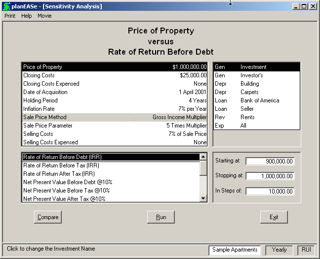
As shown on this screen, which appears when you choose Sensitivity Analysis, selecting the Sensitivity Assumption and Measure is simply a matter of clicking on the appropriate Assumption and Measure names. If the Assumption is not on the first Assumption Page, click the Assumption Page List to display the Assumption Page you want. The measure list is scrollable, so to choose Lender Yield, Capital Accumulation (MIRR Models only), Capitalization Rate, Cash on Cash Before Tax, Debt Coverage Ratio or Loan Amount, scroll the list to the desired area.
When you choose an Assumption, planEASe will suggest a range and step value for varying the Assumption in the lower right hand box. You may change the suggested range and step value, if desired. The total number of steps is restricted to be no more than 11. For example, if you choose to vary the inflation rate between 0% and 20%, you must specify a step value of 2 (or greater) to be within the maximum eleven step range.
When you have set these values as you want, press the Run button to run and view the Sensitivity Analysis and Graph. When the Analysis is complete, the graph appears, and you may pull down Print/Print to print the Sensitivity Analysis (with Graph), or pull down Print/Print Graph to print the Sensitivity Analysis Graph (by itself).
Comparing Sensitivity Analyses You can combine two or more Sensitivity Analyses into one graph or report, which is very useful for Lease/Buy Analysis and other purposes. A sample of such a comparison is shown here.
A fast and easy way to produce this comparison is to, first, choose the Sensitivity Assumption and Measure (the Present Value Discount Rate After Tax and Present Value After Tax here). Second, enter the Starting at, Stopping at, and In steps of values (0, 20, and 2 here).
After making these choices, press the Compare button. When you do so, this Compare Sensitivity Analyses dialog appears, allowing you to specify the Assumption Sets on which to perform the analysis. In this case, we have saved the Lease analysis in the lblease.ru Assumption Set, the Buy
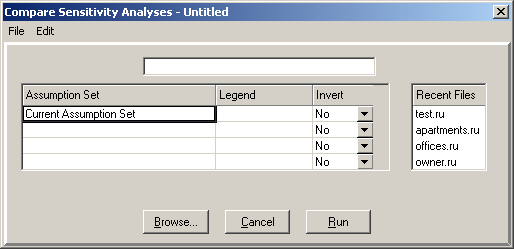
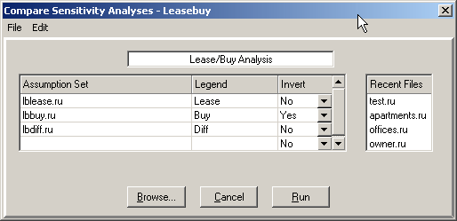
Analysis in the lbbuy.ru Assumption Set, and the Difference between the two in lbdiff.ru. Therefore, these are the specifications we want to enter.
The completed Specification Grid is shown here. We could type the Assumption Set names into the grid, but two other methods are both quicker and more reliable. First, the Recent Files list on the right side of the dialog will typically contain several of the Assumption Sets you want. Just click on the desired name and it will be added to the grid. Second, the Browse... button allows you to choose any file on disk. Here you see the completed dialog leading to the Comparison Sensitivity Analysis on the previous page.
You may insert and delete rows using Edit/Delete Row and Edit/Insert Row. There is no limit on the number of files you may compare, although the complexity of the analysis and the page width of the printed report typically means you probably will use no more than five files.
The first column of the Specification Grid contains the names of the Assumption Sets to compare. By default, the first row contains the text “Current Assumption Set” which means that the Sensitivity Analysis will first be performed on the Assumption Set you are now analyzing. If you do not want that to be so, specify the first Assumption Set (in row 2), click on the first row, and use Edit/Delete Row to delete the first row.
The Legend Column in the Specification Grid is where you enter the name to be shown in the Graph Legend for the analysis (Lease, Buy, and Diff here). If you do not enter a Legend for a particular line, planEASe will, by default, use the Assumption Set name (lblease, lbbuy, and lbdiff) when producing the graph, which can be useful for “quick and dirty” comparisons.
The Invert column in the Specification Grid allows you to change the sign of the cash flows in a particular Assumption Set. Here, the lbbuy.ru Assumption Set shows the Costs of Purchase (negative Cash Flows) and the lblease shows the Revenues due to the Lease (positive Cash Flows). In fact, the Lease alternative is really costs rather than revenues. Therefore, in order to match Costs versus Costs you would Invert lblease.ru. To match positive Cash Flows versus positive Cash Flows, you would invert lbbuy.ru, as we have done here.
Above the Specification Grid is the Title Box, in which we have entered Lease/Buy Analysis”. The text you enter here is presented as the default title when you choose to print the analysis or the graph.
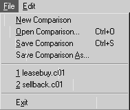
After completing your Comparison Specification, you may save it for later use with File/Save Comparison As... (shown here). leasebuy.c01 and sellback.c01 are two comparison files we saved and ship with planEASe to enable you to perform the comparisons in those sample analyses. The menu shows the last four comparison files you have used, for fast reloading and reruns.