Graphics Extension
The optional planEASe Graphics Extension adds the Graph View to Basic and Detail Analysis, adds the Report/Graph button to the Income Statements, adds Graph Controls to the graphs in Sensitivity and Risk Analysis, adds Pie Charts to the Acquisition Report, Sale Report, APOD Report, Annual Statements, and Rent Roll, and allows the printing, editing, and exporting of any graphs shown on the screen. In total, the Graphics Extension adds millions of Graphs and Charts to planEASe, each of which is filled automatically with data, and properly labeled titles and axes. All these graphs and charts can be edited and further formatted with different fonts, graph formats, grids, perspective, et cetera; and all can be printed in many beautiful color formats with three mouse clicks.
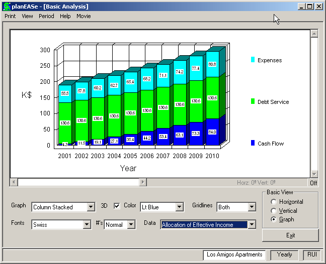
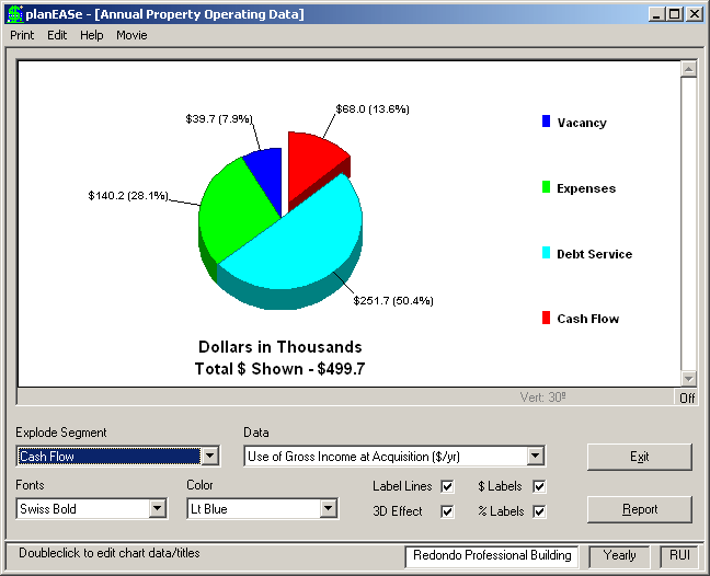
This screen shows the Allocation of Effective Income graph from the Basic Analysis of the Los Amigos Apartments. Below is an example of the available Pie Charts. This one is taken from the APOD Report for the Redondo Professional Building. There are two types of graphic styles in the Graphics Extension : Graphs and Pie Charts. Below (or above in some cases) either of these styles are the Graph Controls. These controls allow you to customize the graph or chart’s appearance to your specifications, as described below.
Graph (graph only) allows you to choose between 10 different graph types to present your data: Column Bar Area Column Stacked Bar Stacked Area Stacked Column Stacked % Bar Stacked % Area Stacked % Line
The graph above is shown as a Column Stack. Experiment with this control to become familiar with the various graph types. The percentage formats are only appropriate when multiple variables (like Expenses, Debt Service and Income here) are being graphed. Choosing Column when graphing a single variable provides a very colorful graph that many prefer.
3D (graph or chart) adds an attractive 3D effect to the graph, but can obscure accurate reading of the data. This effect can also interfere with the proper graphing of negative values.
Color (graph or chart) specifies the first color shown. The remaining colors are automatically
generated from the internal color list. Thus Lt Blue above specifies that Income will be shown in Light Blue.
Gridlines (graph only) allows you to set grid lines to Horizontal, Vertical, None or Both.
Font (graph or chart) controls the typeface used to display the graph labels and numbers. The Body font corresponds to the Body font you choose in the Page Setup Dialog.
#’s (graph only) lets you include the numeric values inside the graph. The Cum ulative setting shows the total value plotted (in stacked graphs), whereas the Normal setting (used here) shows the internal value.
Data (graph or chart) allows you to choose between various available graphs or charts.
Explode Segment (chart only) allows you to explode any segment of the Pie Chart to emphasize it for presentation.
$ Labels (chart only) adds $ values to the segment labels of the Pie Chart, as shown in the example.
% Labels (chart only) adds percentage values to the segment labels of the Pie Chart, as shown in the example.
Label Lines (chart only) adds lines leading to the segment labels of the Pie Chart, as shown in the example.
Perspective In addition to these effects, you may add Perspective to your graphs by using the scrollbars you see at the left (chart or graph) and bottom (graph only) of the graph/chart window. Vertical Perspective allows you to look down at the top of the graph from above, or up at the graph from below, by rotating it on an invisible horizontal axis. Likewise, Horizontal Perspective allows you to look at the graph from either the left or right side by rotating it on an invisible vertical axis.
For all graphs and charts, perspective is automatically turned Off when first viewing the Chart or Graph. You may turn it On by clicking the Off Button at the bottom right of the window. Turning it Off at any time will eliminate all Perspective and return the Chart or Graph to its appearance before Perspective was applied.
You add Perspective by sliding the scrollbars to the desired position when the bottom/right Button says On. After you have added Perspective, and while it is shown, printing the Graph/Chart will show your Perspective in the printed graph/chart.
Adding Perspective may only be performed with graphs/charts when the 3D checkbox has been checked. Likewise, the #’s display is not compatible with graphs shown in Perspective. Therefore, 3D is automatically turned on when you turn the Perspective Button On, and #’s is automatically turned off. When you return the Perspective Button to Off, these controls are returned to their former settings.
You may edit and export graphs and charts, as discussed on the following pages. All settings discussed here, including Perspective, will be shown on exported graphs/charts.
Graph Additions/Overlay In addition to the capabilities described above, the Graphics Extension adds the capability to add two or more items within the same graph, and overlay another item within that same graph when using the Graphics Extension in the Income Statements function of the Reporting Extension. Please see the description of these capabilities in the Income Statements section on page 44.